Superbet
Homepage
Experience Strategy, Service Design

Experience Strategy, Service Design
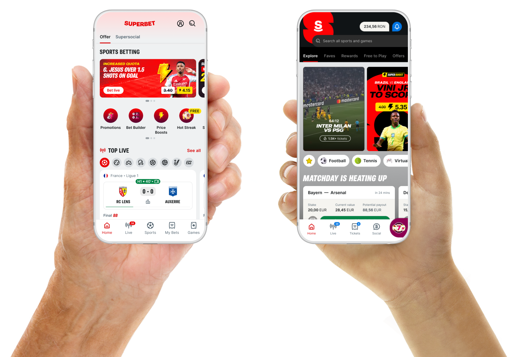
Superbet runs multiple consumer gaming and sportsbook brands across 6 EU & LATAM markets — each with its own regulations and types of customers. Accessed by over 3 million players monthly, generating around €1.8B in revenue annually.
When I joined, all components on the homepage had been designed in platform silos without consideration of the unified surface. Homepage was a static template. Local markets built their own promotions, business partners dropped in quicklinks, and the trading team fed a handful of generic offer carousels. Every user landed on the same page — sports bettor or casino player, first session or thousandth, during a major live event or hunting for niche odds.
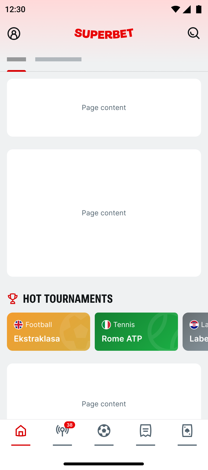
Before
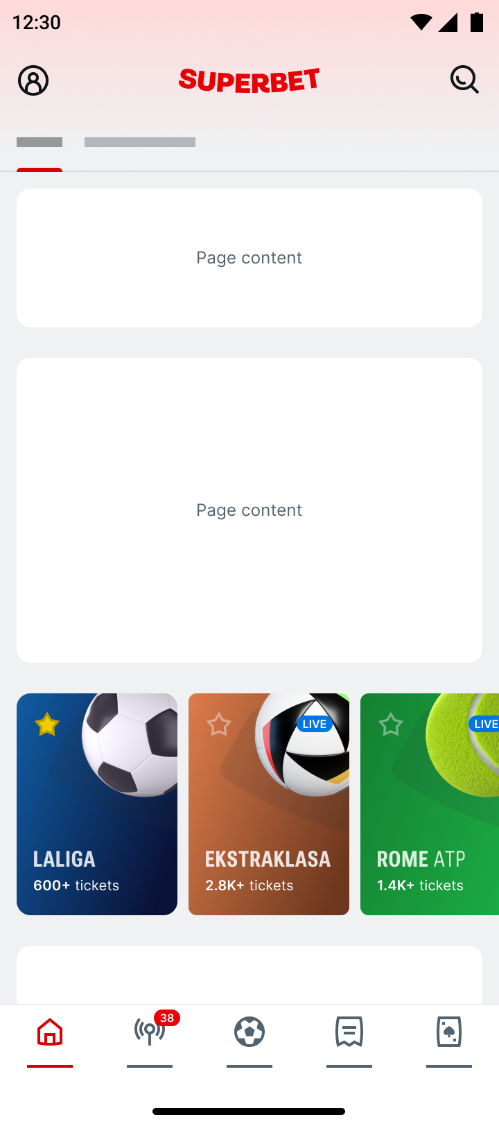
Refine value
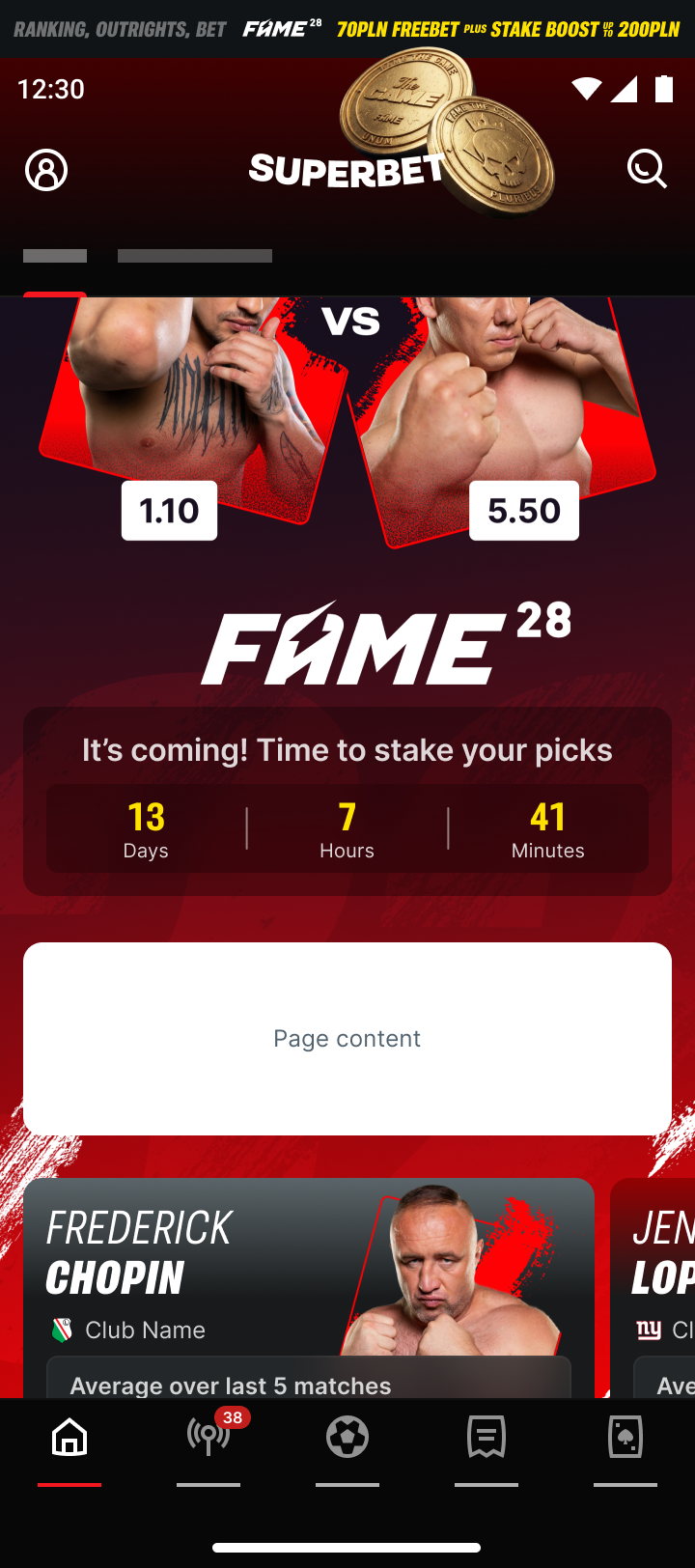
Find radical opportunities
Most users don't come to homepage to browse — they're trying to get in the action, fast. They assume we remember them and how they play. They expect the surface to be in tune with the zeitgeist of day's sports happenings. How is their league ranking? Which odds are heating up? Homepage was disappointing them at first flick.
My team doesn't build the product on the shelf, or design how it looks — same as a grocery store doesn't make or package what it sells. What we own is placement: where something goes, what fixtures it needs, and what position it earns. Every team wants an endcap. My job is to honor existing business agreements, provide optimization guidance, protect the holistic experience, and supply increased value to everyone, including customers.
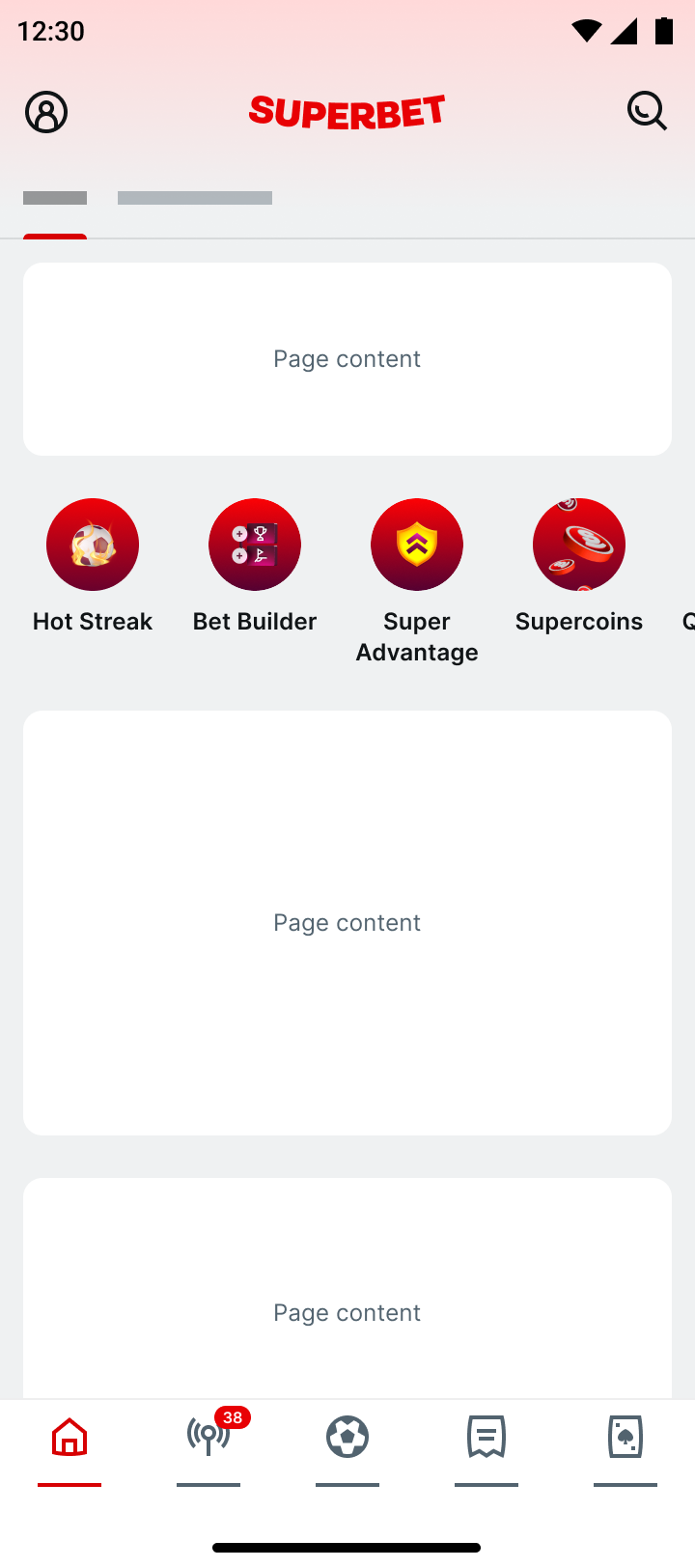
Before
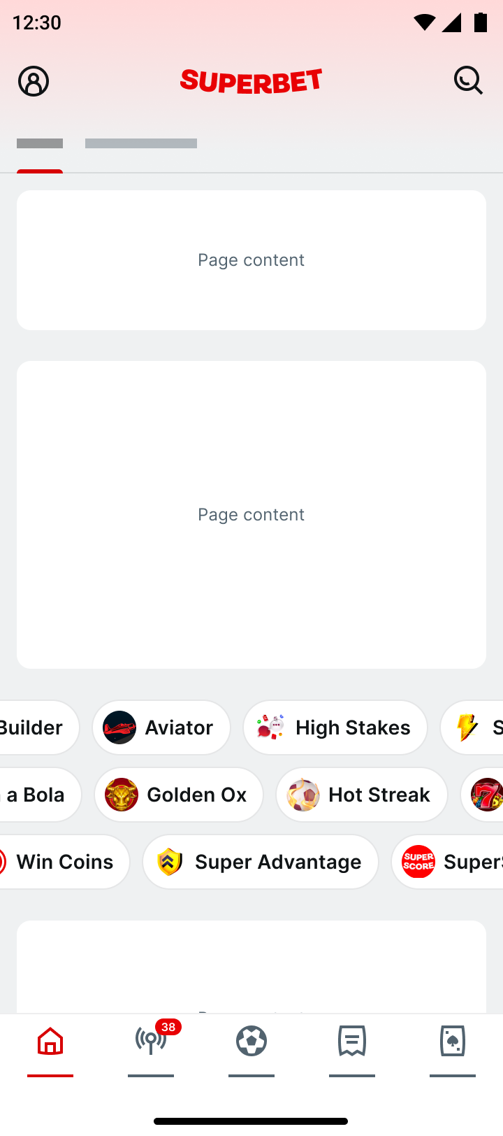
Increase visibility
I started by understanding what partners and users were trying to accomplish. In some cases essential journeys lacked sufficient pathing or context, while in others components were bulky, clogging flow. I began building around how users already move through their tasks on our platform, adding architecture to facilitate their needs.
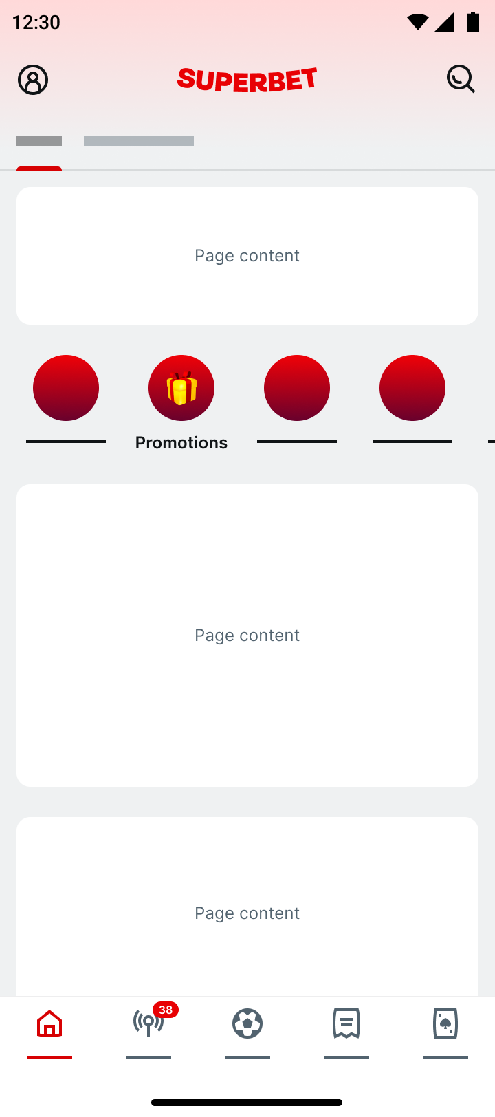
Before
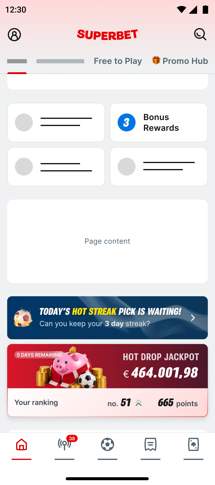
Diverse pathing approach
Once we had merchandising fixtures in place, we could rank, target, and personalize content. Connecting with the user, not just showing what a partner wanted promoted. We could dynamically serve content in formats built to support specific goals goals, like deepening a habit already in motion, or inviting discovery.
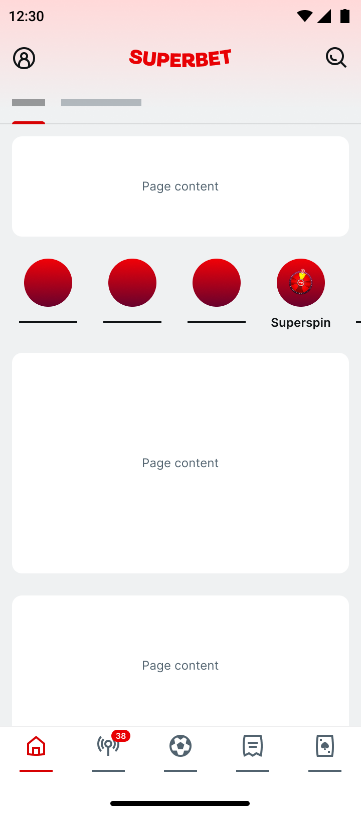
Before
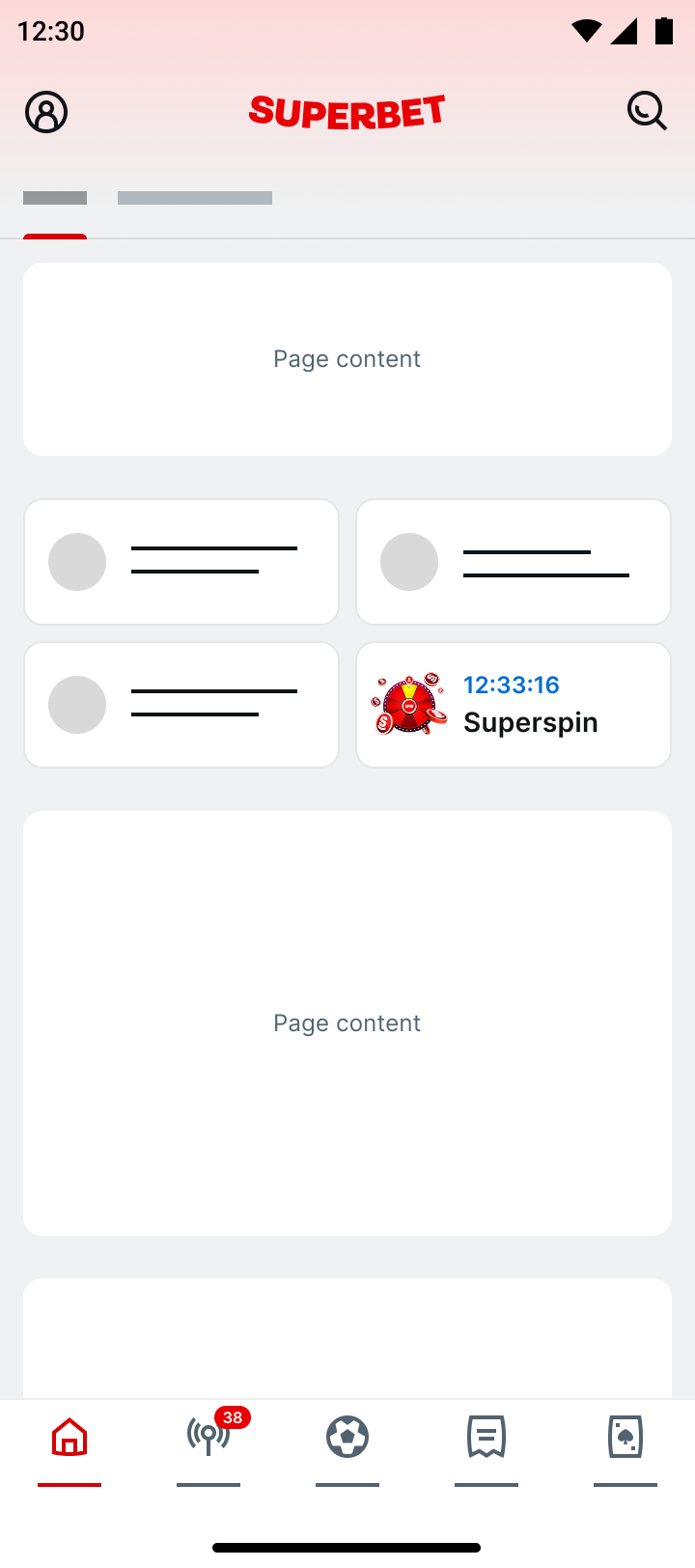
Don't miss out
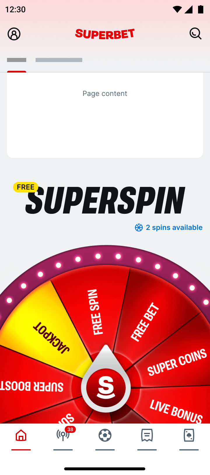
Discover
I looked at what was already working and asked how to make it better, in addition to catching missed connections and needed bridges. The clearest opportunities weren't new features — they were the journeys customers already ran on habit, session after session, regardless of how much friction they encountered.
In the legacy interface, users lacked fast-tracks for common tasks and convenient previews of key data. Customer sessions illustrated pogo-sticking, back-tracking, deep wells of taps-to-goal, and habituated pathing workarounds. Homepage didn't initiate the journeys that mattered. Even search was failing users.
Before (task: navigate to Baseball games)
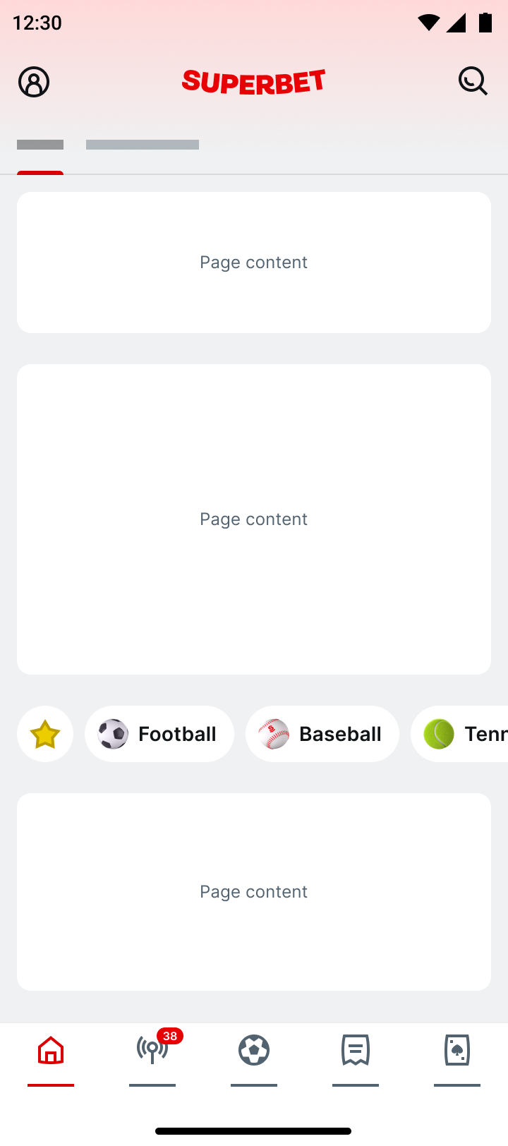
Accelerate access
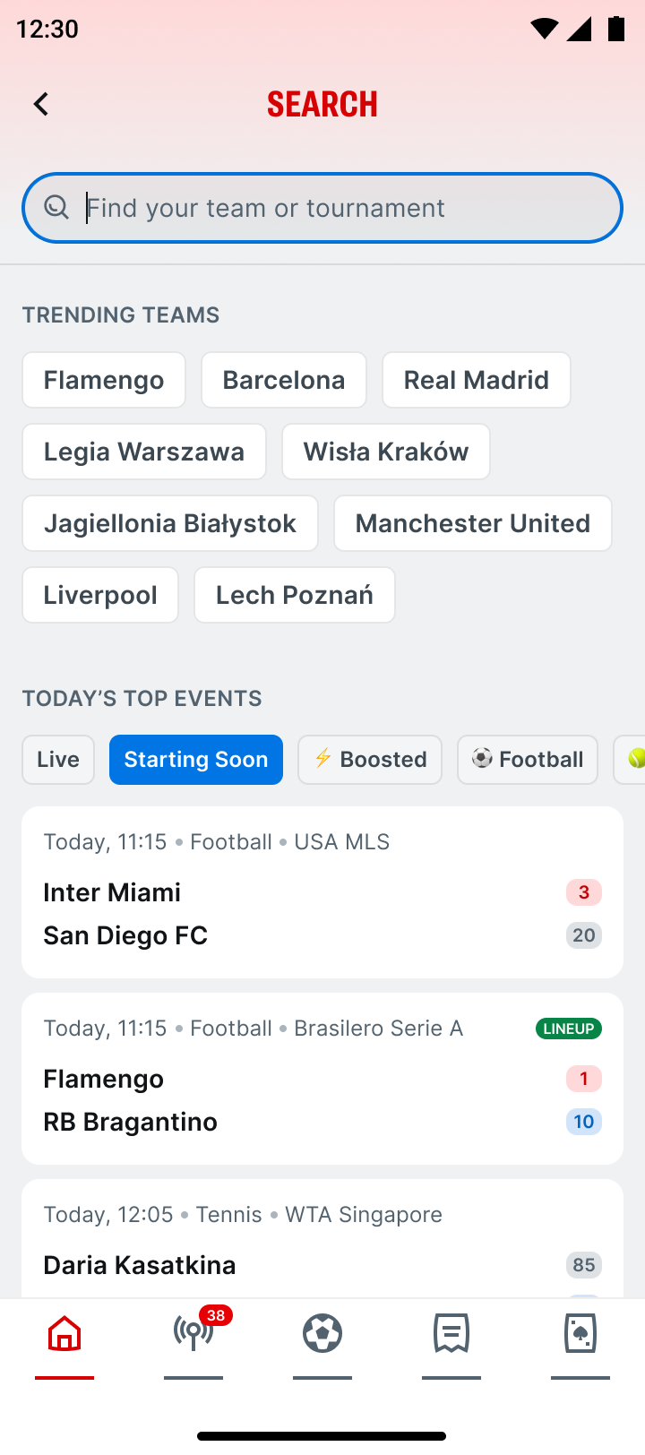
We were able to activate a completely new surface by replacing an empty landing page on search with an quicklink dashboard. In initial iterations with trending teams suggestion chips, we reduced zero-result search by 10%, and replaced 9% of searches with taps. Customers using chips converted at a 17% higher rate.
Before
Facilitate journeys
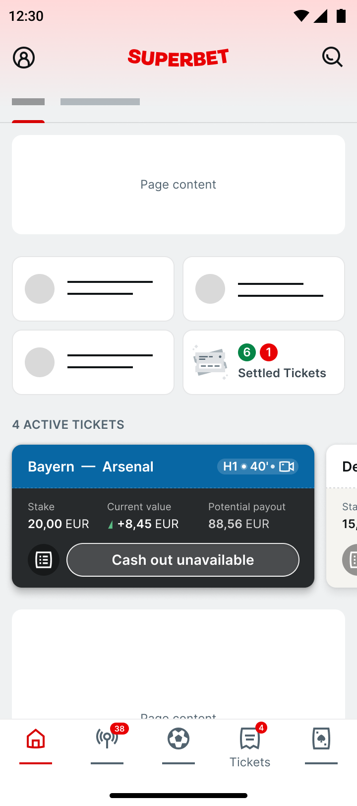
Though core navigation offers access to the tickets environment, I wanted to experiment if bringing key content directly to our logged-in state could save users a trip. I identified key journey moments, and explored various approaches to facilitate tasks. Sometimes, it's the little things.
Before
Info at hand
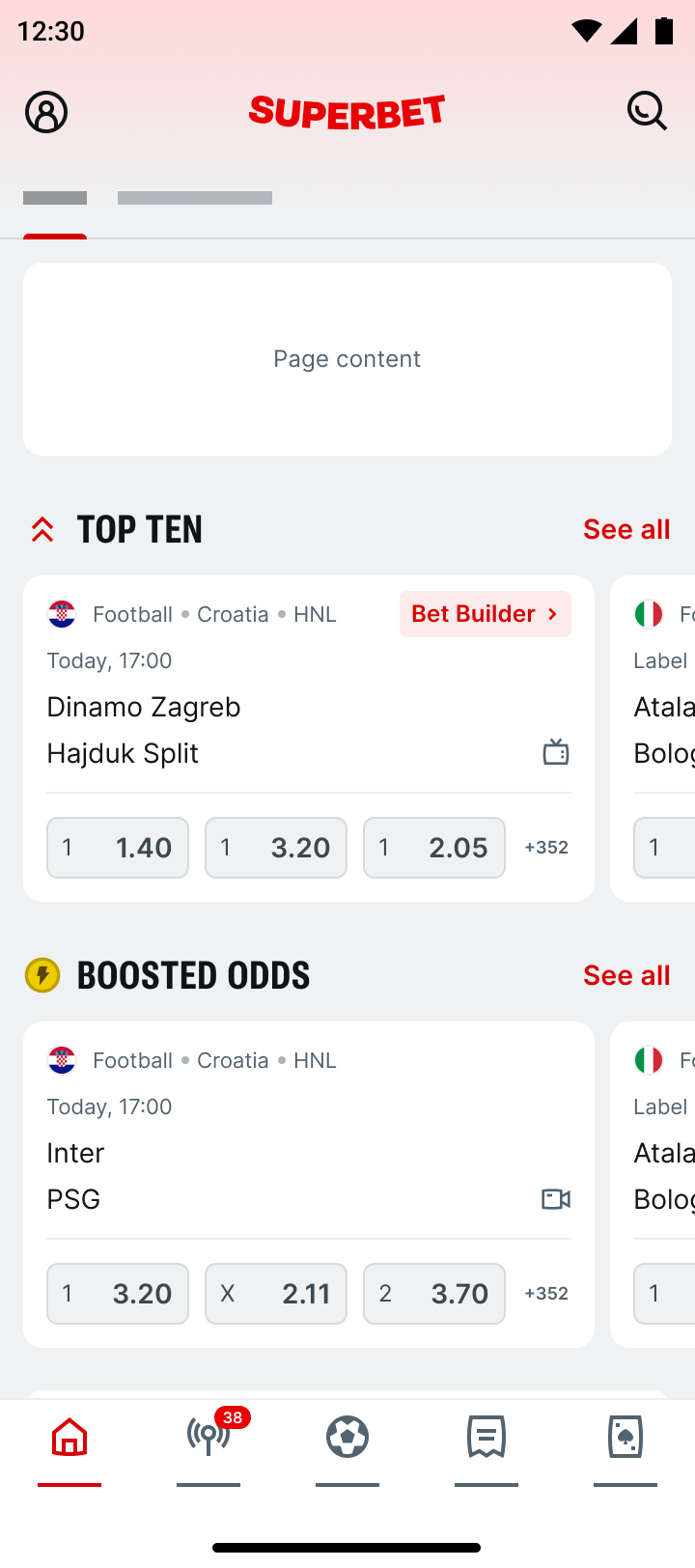
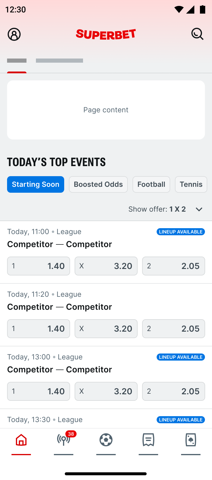
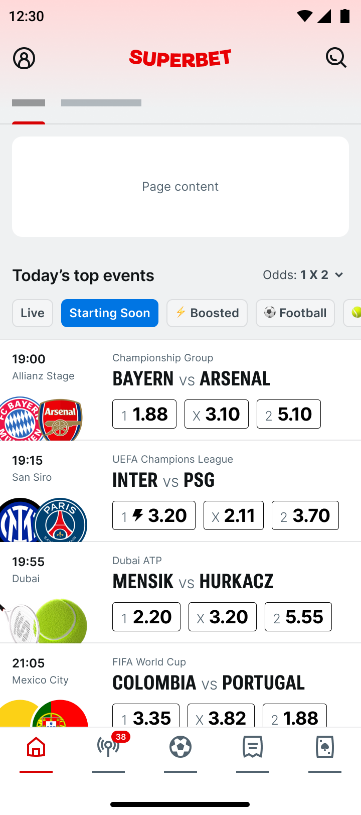
Other times, it takes a village. When we saw how terribly our horizontally scrolling carousels were performing I knew architecture could help with offer delivery — but shifting these lockups meant fiddling with our core revenue devices. To work thru improvements we formed alliances with our cross-platform partners, building our strategy on collective research and insights.
Before
Format improvements
Styling improvements
In the end my goal is to help the customer as well as the business succeed on this surface, and enhance as many journeys as I can. It starts with a few small iterations, but after a few quarters, an entirely new surface comes together.
The means to an end isn't always a bold redesign. Individual validation experiments on the way to success can feel pretty boring. It's a lot of release calendar negotiation, analysis of incremental changes, and heading back to the whiteboard. That's why working flexibly towards a constantly evolving vision is important.
Sports betting has been a truly unexpected vertical for me, but it's been easy to find familiarity within day-to-day user problems. I help teams draft implementation strategy to achieve major product revisions. I engage cross-functionally to plan ways steadily forward, despite a constantly shifting goal. I stay scrappy to accelerate time and work thru metrics goals systematically. Teamwork, alignment, and mutual advocacy are the engine behind the achievements.
One of many discussion aids
Product designers want the best odds to win. Sweeping change alienates users, generates swamps of Jira tickets, and confounds analytics. Tactical, step-by-step progress means less disruption for all, and a steady ramp oriented to improvement as hypotheses refine. The path forward isn't just a series of approvals — it's having a game play strategy.